This is what Wear OS 3 with One UI Watch is like on the Samsung Galaxy Watch 4
Samsung has officially unveiled the Galaxy Watch 4 series, which might be the most significant wearable device Samsung has ever released. The company has given up on its home-grown Tizen software platform (except on TVs), and has now teamed up with Google to develop Wear OS 3. This partnership could make the Galaxy Watch 4 a stronger competitor than ever against the Apple Watch Series 6.
In fact, the Galaxy Watch 4 will likely be the only Wear OS 3 watch for a while — unless a surprise Pixel Watch shows up soon. The next watch to get the update will be Mobvoi’s TicWatch 3 Pro in the “mid to second half of 2022.” If you want to try the latest and greatest from Google and Samsung, your only option for the foreseeable future is a Galaxy Watch 4 (and if you’re buying one, we have some band suggestions).
The version number isn’t the only important factor here. For the first time ever, Google is allowing watchmakers to customize the appearance of its wearable platform, which means Samsung can release Wear OS watches that don’t look or feel much like Wear OS. In fact, the Galaxy Watch is missing many typical Google apps out of the box, and some functionality isn’t available at all right now.
We’re working on reviews of the Galaxy Watch 4 and Watch 4 Classic, but the changes in Samsung’s flavor of Wear OS are so substantial that they’re worthy of their own separate coverage. In this article, we’ll showcase how Wear OS 3 with One UI is different than the Wear OS we’ve all been used to for the past few years.
In many ways, Wear OS 3 with One UI Watch is more like Tizen than Wear OS. Tizen is dead, long live Tizen.
Setup and Pairing on Wear OS 3 with One UI Watch
The first noticeable difference between the Galaxy Watch 4 and all other Wear OS devices is the companion smartphone app. Every single Wear OS watch (and all the Android Wear watches before that) use Google’s companion app for the initial setup process. The app is also used for switching watch faces, taking screenshots, and changing some settings.
The Galaxy Watch 4 is the first Wear OS watch to not use the official Wear OS companion application. Instead, the setup and pairing process is done with Samsung’s own Galaxy Wearable app — the same used for previous Galaxy Watches, the Galaxy Fit series of fitness trackers, Samsung wireless earbuds, and other accessories.
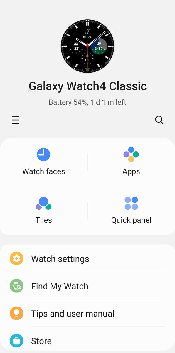
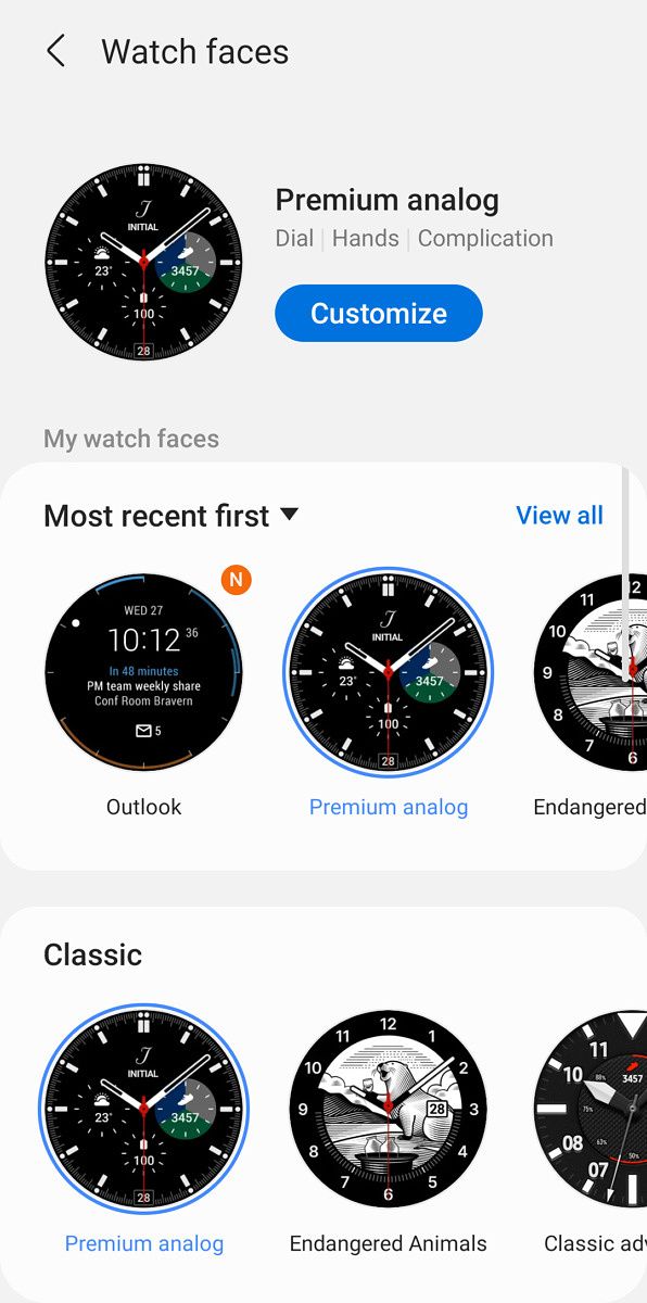


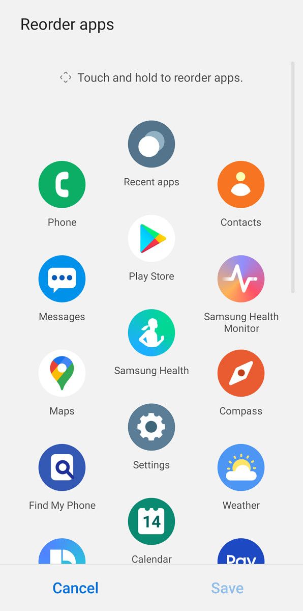
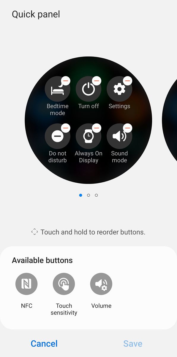
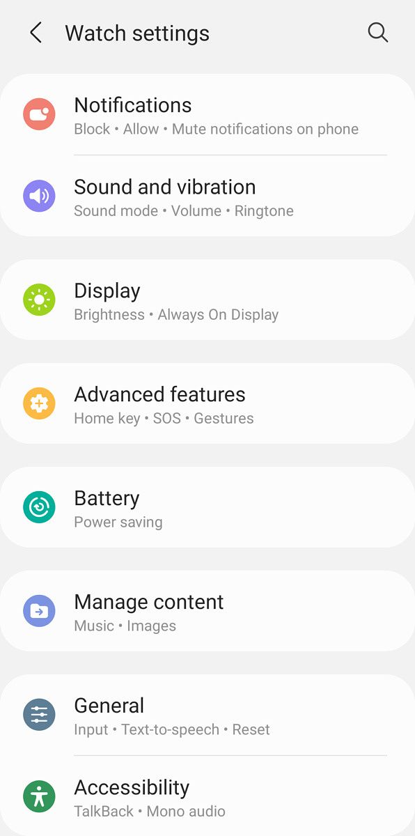
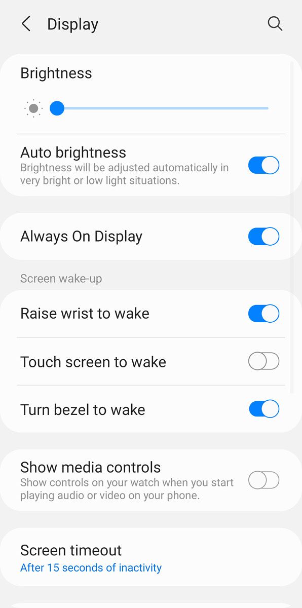
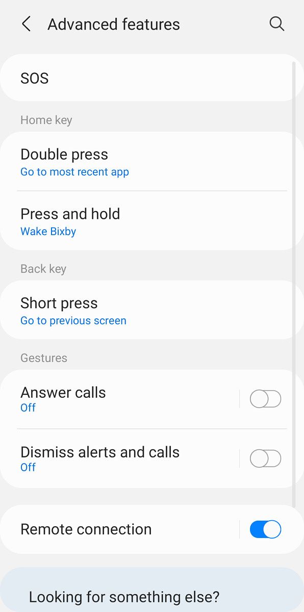


Galaxy Wearable is significantly different than Google’s own Wear OS app, and arguably better. It allows you to change more aspects of the watch from your phone than Google’s Wear OS app allows, such as customizing the app launcher (more on that later), customizing the watch face and quick settings panel, and updating and removing apps. Almost every setting accessible on the watch is also in the phone app, so you don’t have to swipe through all the options on the tiny touch screen on your watch.
It’s likely other Wear OS watches will continue to use Google’s app for synchronization, but I hope Google is planning on bringing these features to its own app. However, the news isn’t all good. Other Wear OS watches work perfectly with iPhones, but the Galaxy Watch 4 doesn’t (at least for now), presumably because Samsung hasn’t updated its iOS Galaxy Wearable app. It’s not clear yet if other Wear OS 3 watches will work with Apple smartphones, but I would be surprised if they didn’t.
Galaxy Wearable (Samsung Gear) (Free, Google Play) →
Watch Face, Quick Settings, and Tiles
Samsung’s flavor of Wear OS will be familiar enough to anyone who has used a Wear OS smartwatch before, but if you’ve used a previous Galaxy Watch with the Tizen operating system, you’ll feel right at home. Some important elements have been moved or redesigned, and only time will tell (pun intended) how many of these changes will carry over to “stock” Wear OS 3 watches.
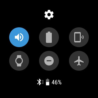

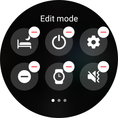
Turning on the Galaxy Watch 4, either by lifting your arm (unless you turn that off) or pressing one of the buttons, lands you onto the watch face. Swiping down opens the quick settings panel, just like on regular Wear OS watches, but the panel on the Galaxy Watch has more buttons. It can also be customized, either from the Galaxy Wearable app on your phone, or by holding down the icons on the watch itself. This allows you to hide the buttons that you don’t want, or move the ones you use the most often to the first page.
Wear OS added support for Tiles in 2019, allowing watches to have pages of information or quick actions (similar to widgets on Android) accessible by swiping left on the main watch face. Tiles haven’t gone anywhere on the Galaxy Watch’s version of Wear OS 3, but Samsung has replaced all of Google’s Tiles with its own versions. The custom Tiles more closely match the design of the pages on older Galaxy Watches.


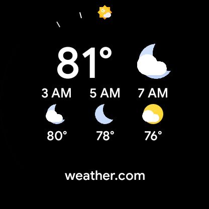
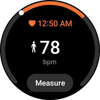
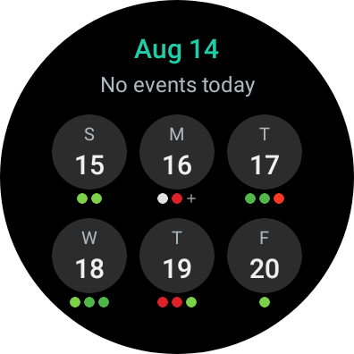

Just as with other Wear OS watches, you can add, remove, and move Tiles on the watch itself, or by using the companion app on your phone. The Galaxy Watch 4 also maintains compatibility with Tiles from third-party watch apps — I had no problem adding the Tile from Wearable Widgets to the end of the list.
Notifications
Existing Wear OS watches display notifications under the watch face, accessible by swiping up on the main screen. Much like on normal Android, alerts are displayed in a continuous scrollable list, and tapping on them reveals the full message (and options for replying). However, Wear OS 3 on the Galaxy Watch 4 changes this completely, in favor of something closely resembling Tizen’s notifications.
Notifications are displayed to the left of the watch face, with each alert as its own page. Just like on Wear OS, tapping the notification reveals the entire message (or chain of messages, if it’s a chat). Both Samsung and Google’s approaches require about the same amount of scrolling and tapping.
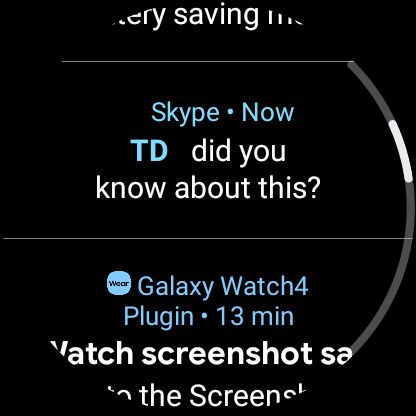
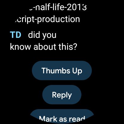
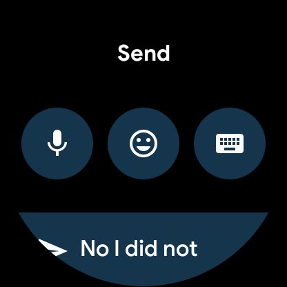
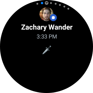


It’s not clear if this custom notification interface will carry over to other Wear OS 3 watches. The latest Wear OS emulator builds have a hybrid of the two designs, with each notification as a full-screen card that can be expanded with a single tap.
App Drawer
Samsung has also changed the location (and design) of the app launcher on Wear OS. The list of apps on other watches is opened by pressing the main side button, with the ability to ‘pin’ a few apps to the top for easier access. Samsung has moved the apps to below the watch face (where the notifications are on other Wear OS watches), and the apps are displayed as bubbles. It looks like the app page on the Apple Watch.
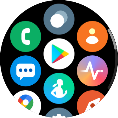
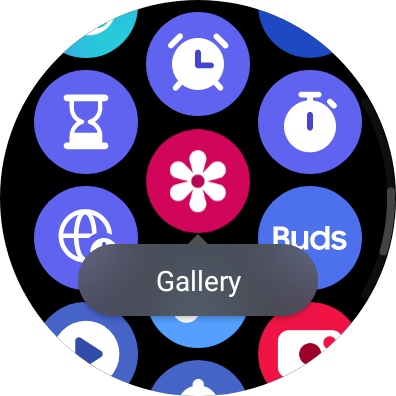

The app drawer might look overwhelming, but I definitely prefer it over the simple app list in Wear OS 2. You usually don’t have to scroll as much to find the app you want, especially since you can move the icons around (either on the watch itself or by using Galaxy Wearable). Here’s hoping some form of this arrives on other Wear OS 3 watches.
Fewer Google services
Samsung made it clear before the Galaxy Watch 4 was fully revealed that it would customize Wear OS to fit in better with its own software ecosystem. However, with One UI Watch, Samsung has seemingly changed Wear OS more significantly than it changed Android on its smartphones.
The only Google apps and services installed on the Galaxy Watch 4 out of the box are Google Maps and the Play Store — that’s it. Samsung Pay is the default payment option instead of Google Pay, Samsung Messages is installed instead of Google Messages, and Samsung Health is used for health tracking instead of Google Fit.
You can still download Google’s apps from the watch’s Play Store and set them as the defaults if you want. However, there’s one omission that can’t be fixed right now — Google Assistant. Bixby is the default voice assistant, and there’s no way to install Google Assistant. Samsung is currently “working closely with Google” to bring Assistant and other functionality to its version of Wear OS, but at least for the moment, you’re stuck with Bixby.
Lots of Samsung apps
Samsung’s Android phones are defined by all the custom applications that are (mostly) not available on phones from other companies, and the same is now true for its Wear OS devices. The Galaxy Watch 4 has several applications developed by Samsung, and most of them are similar (if not identical) to apps found on previous Galaxy Watches.
Some of the apps mirror the functionality of Google’s usual Wear OS apps, like the phone dialer, Contacts app, and Calendar apps. However, all of them have different designs that match Samsung’s One UI, and some have extra features compared to the stock versions. This should sound familiar if you’ve bought a non-stock Android phone at any point — manufacturers love creating their own alternative apps and services.
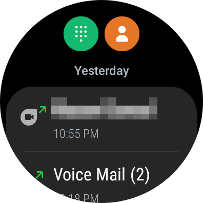

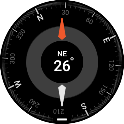


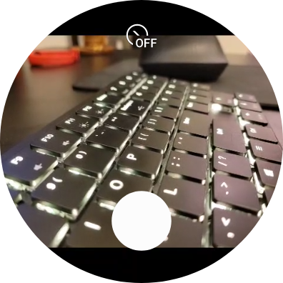
Besides the previously-mentioned Samsung Pay, Messages, Bixby, and Samsung Health, there’s also a Gallery (mostly for viewing screenshots), Compass, Weather, Calendar, Find my Phone, Clock, Timer, Alarms, Camera (a viewfinder for the camera on Galaxy phones), Media Controls, Voice Recorder, and a Calculator. Spotify and Microsoft Outlook are also pre-installed. Spotify on my review unit is the same basic remote control app that’s been on Wear OS for years, but the promised update with offline playback support is slowly rolling out.
My favorite custom Samsung app is Music, which works exactly the same as the Music app on previous Galaxy Watches. It allows you to copy music files from your phone to the watch (using the Galaxy Wearable app) without the need for a subscription service like Spotify or YouTube Music. I keep some music stored on a personal Plex server, and it doesn’t take much work to transfer those tracks to the watch.
Other changes on Wear OS 3 with One UI Watch
These are some other noteworthy changes we noticed in Wear OS 3 on the Galaxy Watch 4, compared to earlier Wear OS watches.
- You can use SmartThings Find to locate the Galaxy Watch 4, or mark it as lost to receive an email when it’s found by other people in the Find network. The Watch 4 also works with Google’s Find My Device service, like all Wear OS watches.
- Screenshots can be captured by pressing both side buttons at once. It’s not possible to take screenshots on other Wear OS watches with a simple shortcut — it can only be accomplished through the Wear OS app on the phone, or by using ADB. I can’t tell you how much this helped me while writing this article.

Galaxy Watch 4 in Samsung Find My Mobile
- Wear OS 3 on the Galaxy Watch 4 has a new setting to choose the default apps for the digital assistant, home app, and phone app, just like on normal Android. Before anyone asks, we already tried sideloading Google Assistant and setting it as the default assistant, but it didn’t do anything.
Conclusion
I’ve spent years using various Wear OS devices (going back to the Samsung Gear Live) and Tizen-powered watches, so I was excited to see what the two platforms would look like combined. Google hasn’t shown off what “stock” Wear OS 3 will look like yet — only emulator images that seem to be a hybrid of 2 and 3 — leaving us with the Galaxy Watch 4 as the only insight into how Wear OS 3 works.
Samsung’s flavor of Wear OS 3 is substantially different than any Wear OS watch I’ve ever used, and there are still some features (like the camera shutter and ECG monitoring) that require a Samsung-made phone (and as a side note, we haven’t yet tried enabling ECG and blood pressure monitoring with non-Galaxy devices). I’m surprised by how much leeway Samsung was given to customize Wear OS — the entire core interface is different, and the only included Google apps are Maps and the Play Store.
Even though I haven’t encountered any stability issues with Wear OS 3 on the Galaxy Watch 4, it does feel a bit like pre-release software. Some of the promised Wear OS 3 apps haven’t arrived yet (such as YouTube Music), and Google Assistant isn’t available at the moment. The lack of iPhone pairing support is also strange, given that previous Galaxy Watches and all current Wear OS wearables can be used with iPhones.
- This year's Galaxy Watch 4 comes with Wear OS and is available in two styles.
I’m interested to see how much of this experience carries over to other Wear OS 3 watches. However, if Samsung’s phones are any indication, future wearables from companies like Mobvoi and Fossil could look completely different.
The post This is what Wear OS 3 with One UI Watch is like on the Samsung Galaxy Watch 4 appeared first on xda-developers.
from xda-developers https://ift.tt/3sqdSGJ
via IFTTT

Aucun commentaire: